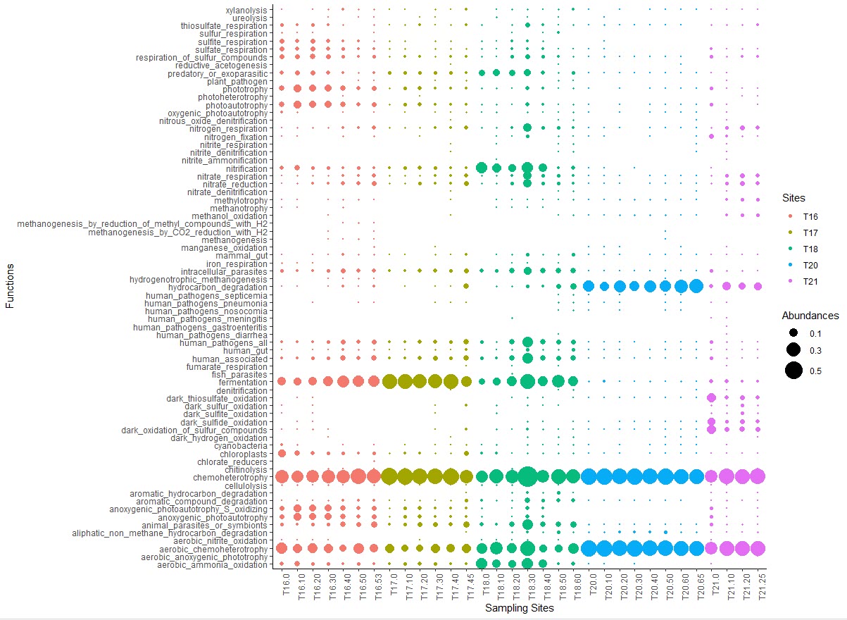
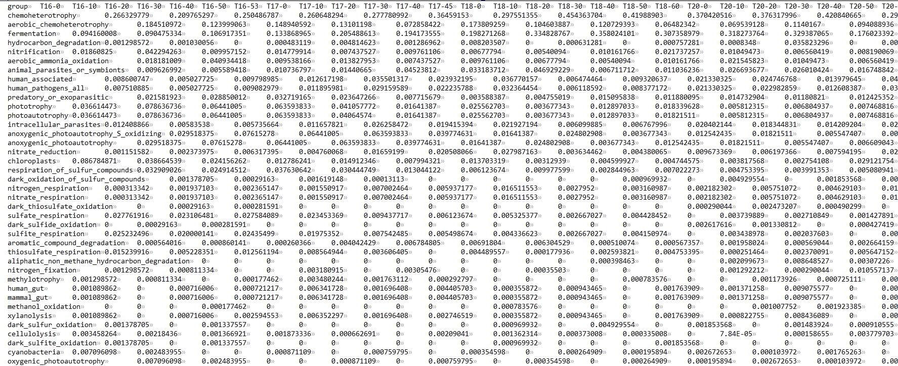
气泡图是经常用到的一种图,可以对比不同样本中某个特征的丰富度差异。以下代码 “bubbleChart_No0.R” 用于气泡图的绘制,零值将不会在图中输出。
#!/usr/bin/env Rscript | |
setwd("E:/Researches/lujia16S/Analysis_20200907/Downstream_analysis/Function")#设置工作目录 | |
#pdf(file="FunctionsBubbleChart.pdf", width=14, height=11) | |
# 读取文件 sep 根据文件格式确定 | |
data <- read.table("functional_table3.tsv",header = TRUE, sep = "\t") | |
library(ggplot2) | |
library(reshape) | |
data_melt <- melt(data) | |
names(data_melt) = c("Functions", "Samples", "Abundances") | |
data_melt$Sites=substring(data_melt$Samples,1,3)# 根据第二列的样本名称提取站位信息,用于后续着色 | |
data_melt <-as.data.frame(data_melt) | |
# 做主图 | |
bubble <- ggplot(data_melt[which(data_melt$Abundances>0),], aes(x = Samples, y = Functions, size = Abundances, color = Sites)) + geom_point() | |
# 字体修饰 | |
##windowsFonts(myFont = windowsFont("Times New Roman")) | |
# 修改细节 — 图注,点大小,点 shape | |
bubble_style <- bubble + theme_classic()+ | |
labs( | |
x = "Sampling Sites", | |
y = "Functions", | |
color="Sites", # 颜色图注名 | |
size="Abundances")+ # 大小图注名 | |
scale_size(range = c(0.1, 10), breaks = seq(0.1, 0.6, 0.2)) + #等比修改圆圈大小 | |
theme(plot.title=element_text(family="Times New Roman",size=8, | |
color="red",face="italic", | |
hjust=0.5,lineheight=0.5), | |
plot.subtitle = element_text(hjust = 0.5)) + | |
theme(axis.text.x = element_text(angle = 90, hjust = 1)) | |
#dev.off() |
# 使用方法
在 Rstudio 中运行以上代码,注意更改自己的工作目录和输入文件。
# 脚本获取
关注公众号 “生信之巅”,聊天窗口回复 “b68c” 获取下载链接。
 |  |
敬告:使用文中脚本请引用本文网址,请尊重本人的劳动成果,谢谢!
